Corporate Wellness Enrollment Redesign
Peloton provides a corporate benefit to hundreds of company partners that includes discounts on the equipment as well as free or discounted app membership. It’s a compelling benefit for those who like to take health & fitness classes, but there were clear problems with the benefit enrollment flow. Only 7% of users who actually took action to enroll, demonstrating interest, actually finish enrolling in their benefit. This is surprising since it’s provided to them for free.
We also heard from 50+ users/mo who thought they claimed the benefit, but didn’t actually complete the process, indicating confusion with the flow. As the corporate wellness design lead, I redesigned the entire flow from start to finish to modernize and optimize for enrollment conversion. Below is a preview of the flow – the first landing page that a user would see, explaining what they receive with the Peloton benefit and prompting them to search for their company.
Try the prototype in Figma.
Find your power Campaign
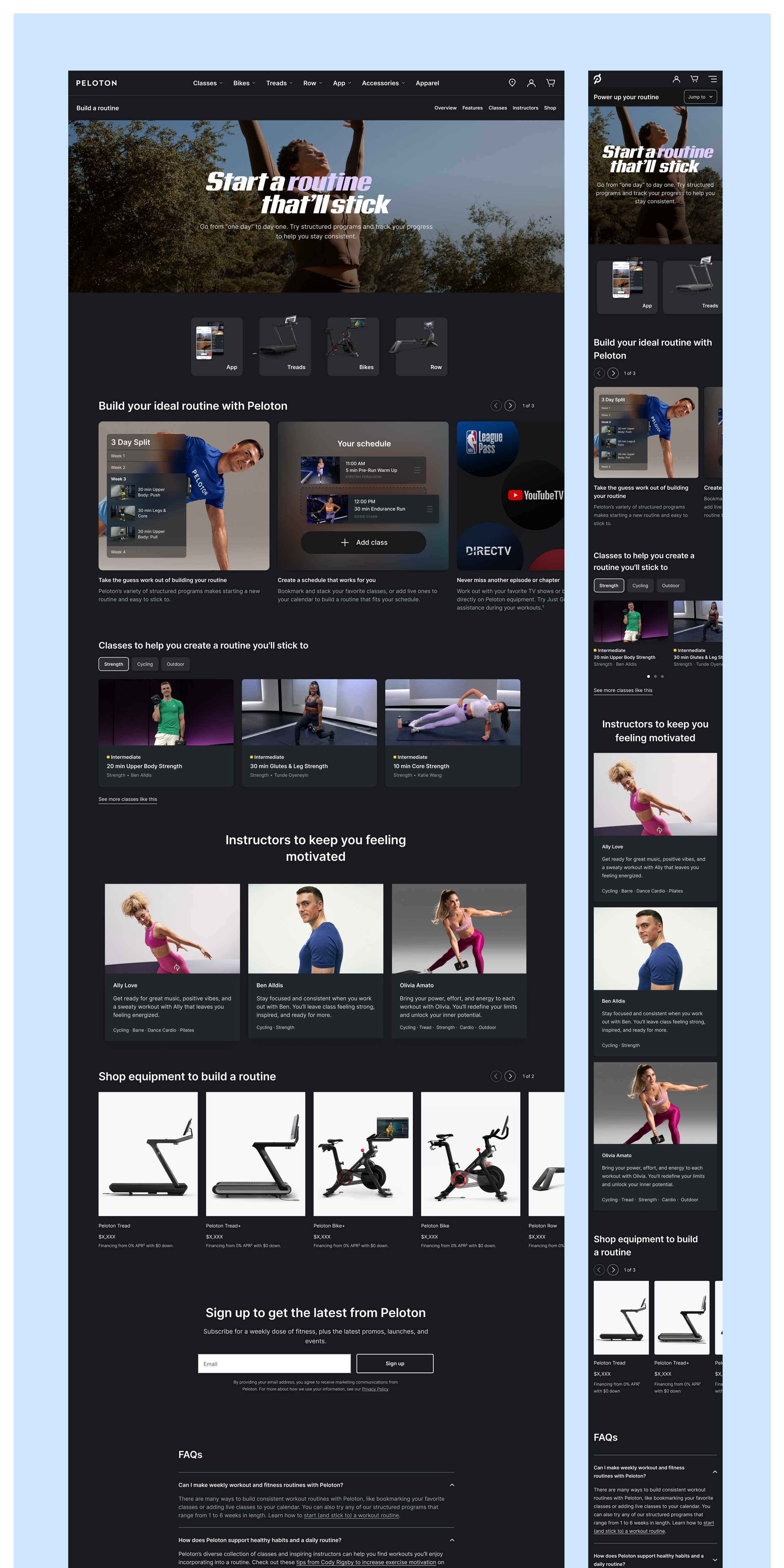
Peloton receives 40% of its annual sales during holiday season, so it should come as no surprise that we run many tests to optimize our site ahead of the holidays.
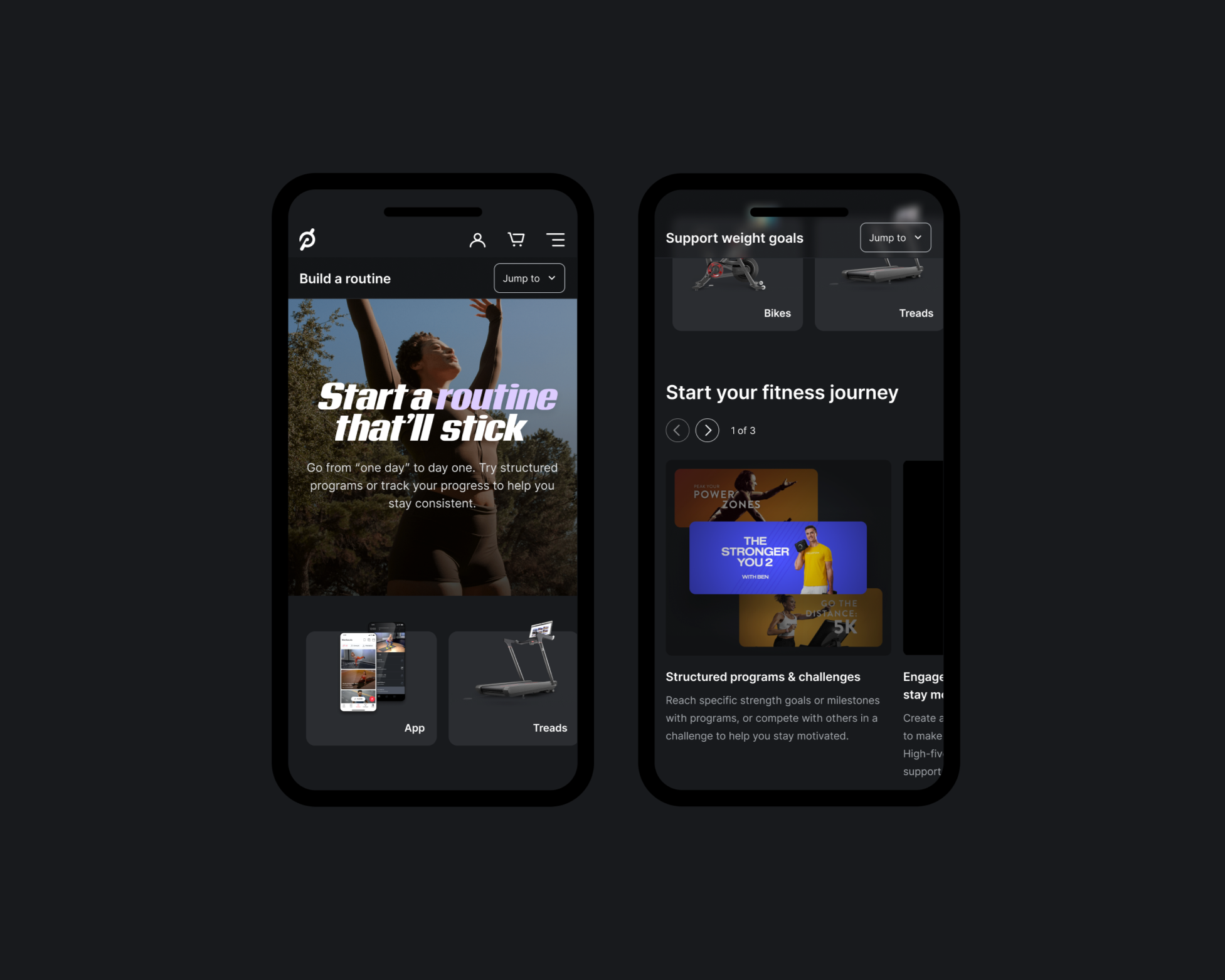
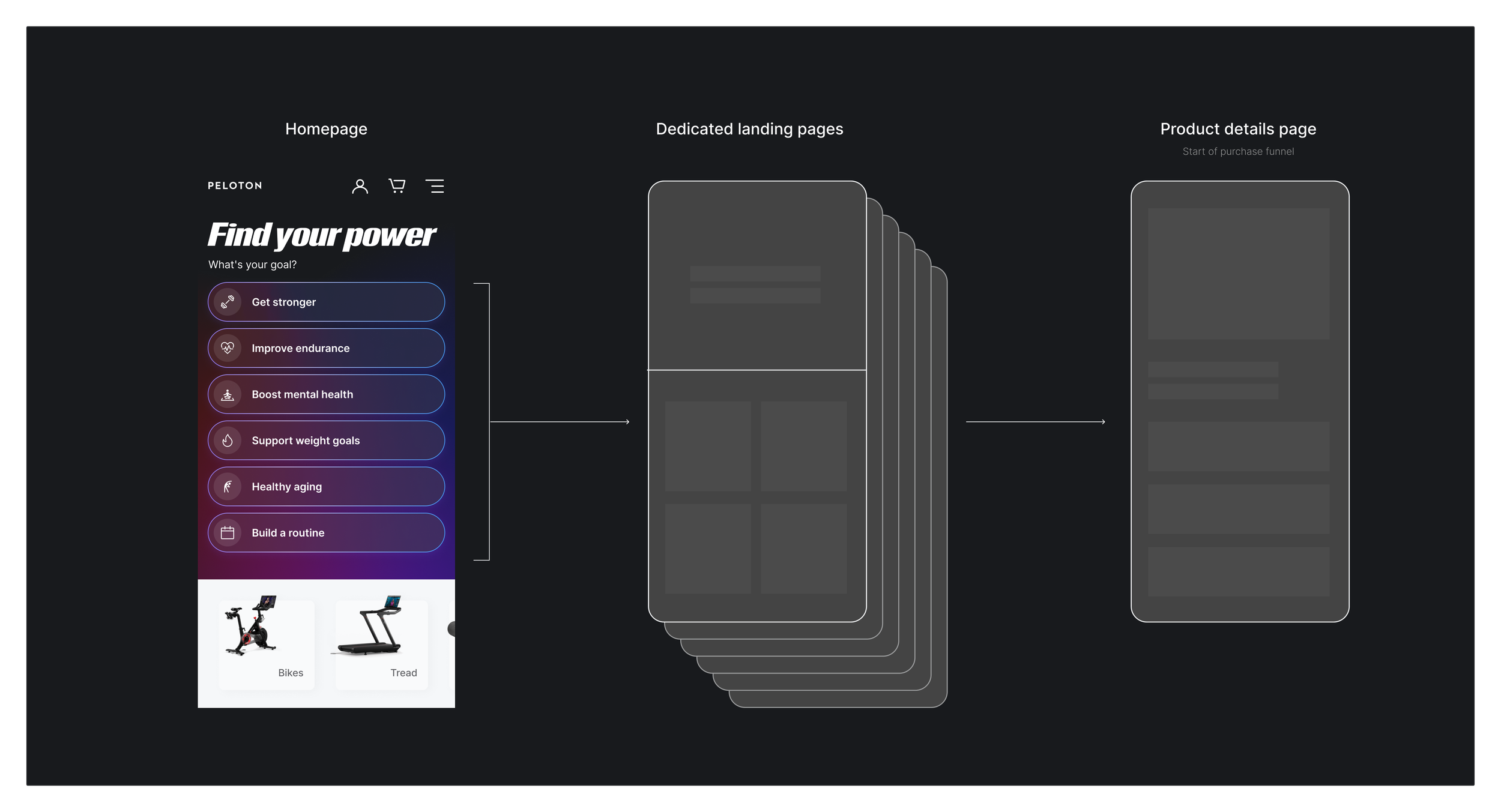
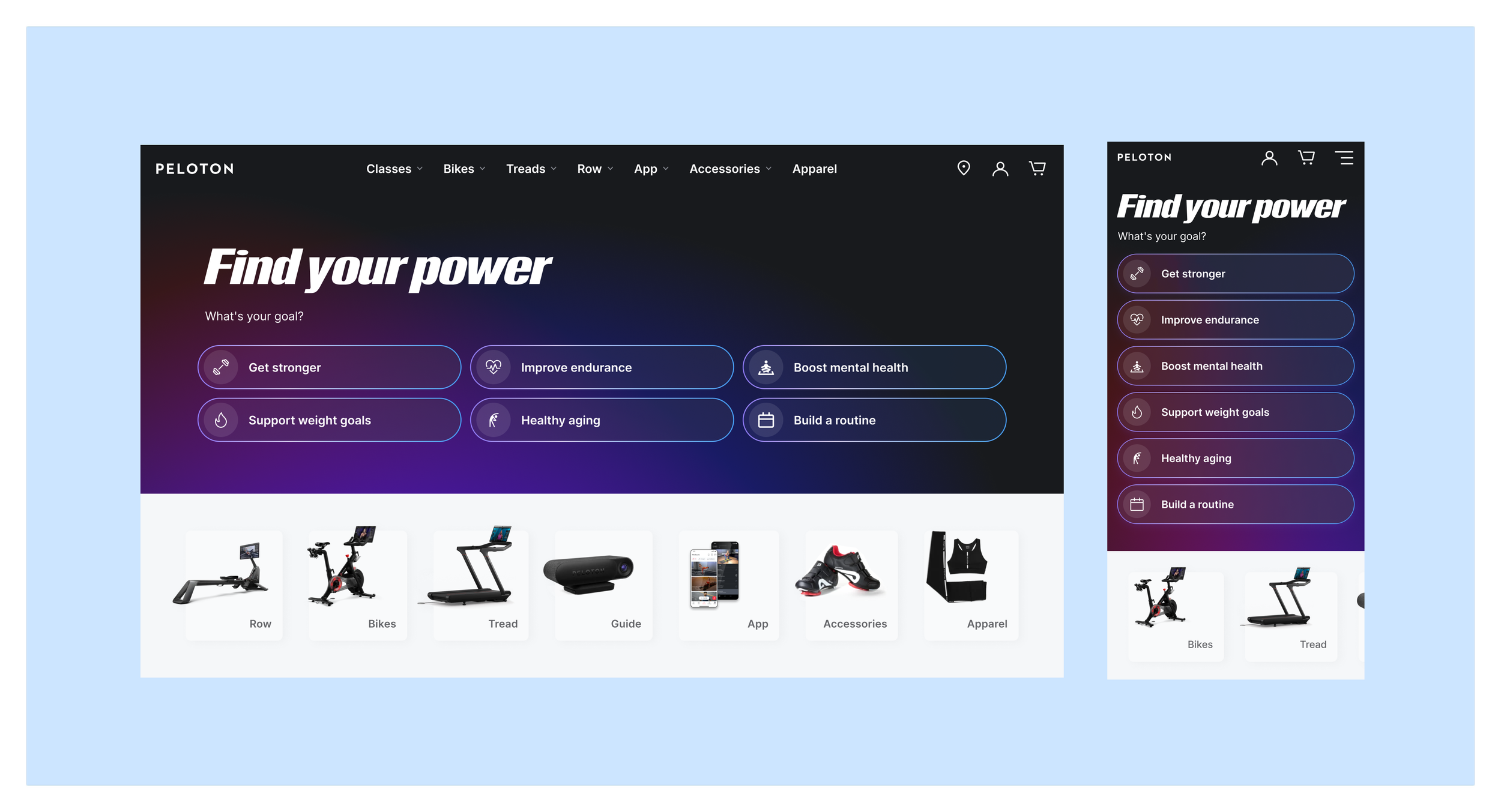
This year, we tested a goal-oriented hero section on our homepage that linked out to 6 different landing pages to drive conversion and set the perception of Peloton as a product people can lean on to achieve their goals. This was for top-of-funnel customers who don’t know much yet about Peloton. Our goal was to have high engagement on the landing pages, achieve flat overall conversion and flat add-to-cart rates.
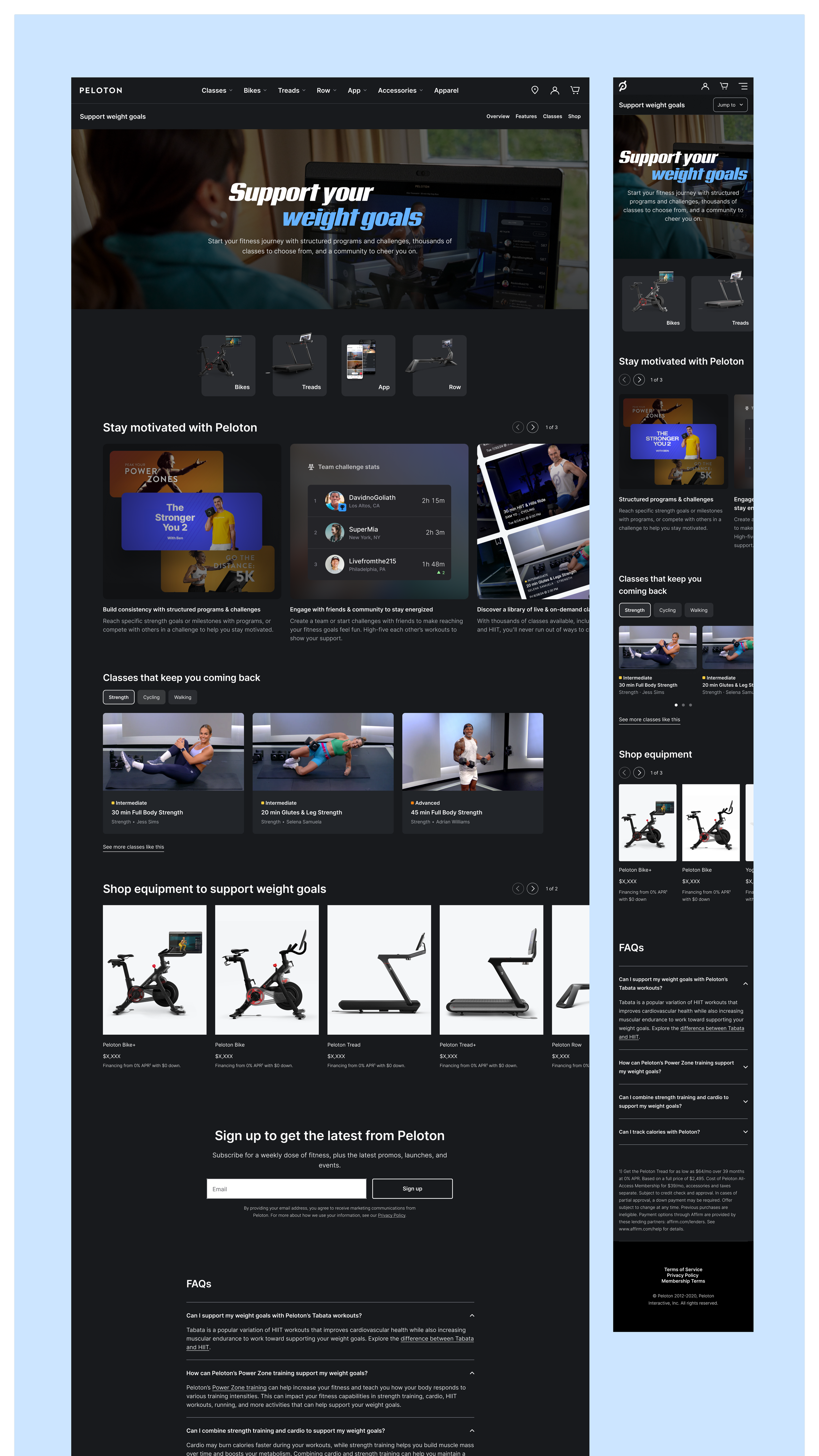
I designed 3 of the landing pages (2 are shown below), including all graphics, marketing Peloton as a service that can help support your weight goals, age healthily, and build a routine. An A/B test ran for 2 weeks on the homepage, and we saw a 26% boost in clickthrough rate on the new design’s hero, marking extremely high engagement. We also saw +2% in traffic to the product landing pages and +6% conversion, indicating that more users are getting down the funnel and completing their purchase. This all marked a very successful project, and we have since rolled this out as the hero experience on the Peloton homepage.
See it live: Build a routine | Support weight goals | Age healthily
Lululemon x Peloton Landing Page
As part of multi-year deal with Lululemon, Peloton provides special promotions for Lululemon members, to be claimed online. As the Corporate Wellness designer, I design all of the microsites and landing pages to make this happen. This is one of the promotions – an extended free trial on the Peloton App.
More case studies available upon request